P1: DESCRIBE INTERACTIVE MEDIA PRODUCTS

In detail what the actual purpose of the product is
Ebay is a multi-commercial corporation that has both customer-to-customer and business-to-customer sales with a broad range of different items. The purpose of Ebay is to allow users to shop, sell and give. In detail, they give sellers ‘the platform, solutions and support’ that they need to grow their businesses if they need to distribute their products. As it is a global platform, nearly everything can be put on Ebay and made available for purchase.
The other platforms this interactive product is available on and which is your preference
Ebay is online website but has a Ebay app that can be downloaded from app store on Apple devices, such as an iphone, ipod, and ipads. This is for when users are on the go and would like to order an item or sell a belonging from their phones or portable devices. There is also an app for android users, but many people use the main website online to access Ebay. My preference is using the app on my phone because it is quicker and easier to take a photo if I want to sell something, and I can take the app with me wherever. Although, I do prefer the layout on their website as it is clear to see everything.
The design components and layout and your experience of it
Ebay has a clear layout, making it easy to navigate and read. All the text is presented in a straightforward font and is positioned in a spaced out structure, so nothing is crowded. There is a button that is labelled ‘All Categories’ for users to find what they want to buy quickly and to be more specific in their findings, there is a search engine. The colour scheme for the background is a plain white which, in my experience, I like because it doesn’t over-complicate or contrast the multi-colours scheme for the text and colours.
The interactive features of the product - what are they and what’s your experience of them like?
One of the first interactive features on Ebay users tend to do is the sign up/register if the items want to be sold or brought. The process is short and easy to register. The search engine is where myself and other users to find a product easily. My experience of this the
There is a tab that takes users straight to a review and feedback page, so if there is any problem, Ebay can quickly fix it.
The benefits of the interactive product
- It is easy to register and makes the buying process quicker. Registering with an email also allows users to receive updates on their own or similar products they might like.
- Ebay is a global platform so everyone can use the site to their needs, allowing Ebay to gain profit.
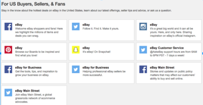
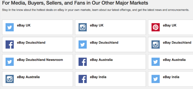
- Another way to stay updated with ebay is through the social media links.
|
Social Media Ebay Accounts
|
Ebay Accounts Across Countries
|
The limitations of the interactive product
One limitation for users on the device of a laptop or a computer, it is either difficult to take a photo from the webcam or a long process to upload images of the product that the user wants to sell onto the computer. This is one reason Ebay has a app for phones, as it is easier process to take a photo and simply upload onto their account for other users to see the look of their product.
The effectiveness of the interactive product
As a past user, I found this interactive product effective as the products I wanted to buy were easy to find through simple navigation issues. Also due to the range of platforms Ebay an appear on, the accessibility is high and can be used at any time. Evidence of Ebay's success is through these statistics.

Are there any legal and ethical issues of the interactive product?
Ebay, to be this successful, would have to consider the Data Protection Act as people would have to include personal information in their account, especially an address if a delivery is involved. Their data must be protected but not all information is private, for instance, the name of the company, telephone, email and location. The details that must be kept private and protected is credit card and bank details as some customers are dealing with expensive amounts of money.
Ebay, to be this successful, would have to consider the Data Protection Act as people would have to include personal information in their account, especially an address if a delivery is involved. Their data must be protected but not all information is private, for instance, the name of the company, telephone, email and location. The details that must be kept private and protected is credit card and bank details as some customers are dealing with expensive amounts of money.

Social Networking: Facebook
In detail what the actual purpose of the product is
Facebook is an American corporation as an online social media and networking service. Founder of Facebook, Mark Zuckerberg, comments the purpose of 'To make the world more open and connected'. In detail, Facebook allows people to have their own personal profiles and connect with friends and family across the world. Facebook also allows businesses to begin by creating their own pages to distribute their own products in media forms of images and videos.
The other platforms this interactive product is available on and which is your preference
Facebook is available on apple devices such as iPhones, iPads, computers, laptops and androids. With Facebook, there is a joint venture subsidiary of the app Messanger that allows an easier way to message people. I prefer using Facebook on my phone as I find the layout easy to use and it is a easy access, with being able to take the app with me.
The design components and layout and your experience of it
It is made very important that Facebook has a clear and understandable layout because it has a users as young as 13 years. The colour scheme is simple but has been iconic and known to made people that the blue colours relate to the social media site. Although Facebook may be confusing to a new user due to the amounts of content but they make sure to format their components evenly. On the side, there is a list of the users friends that are currently online or have been recently. The register page is the first page you see before logging in, it is a simple process by typing in your email and password. In my experience, I like the 'keep me logged in' option as it saves me time when I want to visit the site instead of having to log in each time.
The four main tabs people use or check on Facebook regularly is when they get notifications of these symbols.

The first tab is the home button that takes you to the main page/the user's timeline or refreshes the page for more updated information. The next button is where users get notified when someone sends them a friend request, the next button is messaging and the world symbol is general notifications of either who has liked your profile picture, shares, comments and what you've been tagged in.
The interactive features of the product - what are they and what’s your experience of them like?
The search bar is featured at the top that allows people to search for either other users by name, a different site such as a Facebook music page or location. On the side, there is a list of the users friends that are currently online or have been recently. I
The benefits of the interactive product
As a regular Facebook user, I think privacy can be a limitation as I don't feel like my personal data such as my age and location is fully protected and safe. On Facebook's homepage on the website format, there is a trend section which I personally don't take much notice of and feel it can get in the way. So the homepage is less crowded, I would prefer if there was a separate page for trending news.
The effectiveness of the interactive product
I think Facebook is a very successful interactive product, being launched in 2004 and has made connection with friends easier for users such as myself. I also use it as a way to keep updated with what is going on in the world and with my friends. I can also post
Are there any legal and ethical issues of the interactive product?
Legal issues Facebook had to consider is the Data Protection Act as the site asks for their age, birthday, email address and location. This also links with Privacy Act, as there are settings on Facebook to keep certain information private.
The search bar is featured at the top that allows people to search for either other users by name, a different site such as a Facebook music page or location. On the side, there is a list of the users friends that are currently online or have been recently. I
The benefits of the interactive product
- There is a wide range of things for users to do. It allows people to connect with friends through their interests of 'likes, sharing and commenting', making it a easy way to express their opinion. Games can also be accessed through Facebook and allows people to challenge their friends.
- It is a global platform so people can connect with family and friends from different countries. This also helps with distributing world news.
- It is simple to register and log in. Facebook also helps find the user friends when you fill out your hobbies, interests and past schools you attended. Messaging is also free, making it easier and more beneficial that texting someone.
As a regular Facebook user, I think privacy can be a limitation as I don't feel like my personal data such as my age and location is fully protected and safe. On Facebook's homepage on the website format, there is a trend section which I personally don't take much notice of and feel it can get in the way. So the homepage is less crowded, I would prefer if there was a separate page for trending news.
The effectiveness of the interactive product
I think Facebook is a very successful interactive product, being launched in 2004 and has made connection with friends easier for users such as myself. I also use it as a way to keep updated with what is going on in the world and with my friends. I can also post
Are there any legal and ethical issues of the interactive product?
Legal issues Facebook had to consider is the Data Protection Act as the site asks for their age, birthday, email address and location. This also links with Privacy Act, as there are settings on Facebook to keep certain information private.

Journalism: The Guardian
In detail what the actual purpose of the product is
The Guardian gives the news, sports and their own journalist opinions to readers.
The other platforms this interactive product is available on and which is your preference
The Guardian can be available on iPhones, iPads, computers, laptops and androids. My preference is the online website because I feel it is easier to navigate and view different stories.
The design components and layout and your experience of it
At the top, there is text that is underscored to show the users that it is a link that will take them to a separate page to register if wanted. The format is organised in detail and is separated into the most recent news appearing first, and then it is also broken down into further sections of sport and opinion. I personally like the design and layout, especially the feature component of the weather. The design and colour scheme is kept simple but also remains professional to higher class audience.
The interactive features of the product - what are they and what’s your experience of them like?
The users can use the search engine to find stories they have published or use the tab bar to categorise their search. There is a link where users can also subscribe to the website to have regular updates. There is a comment/discussion page where users can share their opinions or complaints.

|

|
The benefits of the interactive product
The site is designed in a way that may not appeal to all audiences.
The effectiveness of the interactive product
As it is a daily newspaper, the website is updated frequently which makes the product effective as the users are constantly updated.
Are there any legal and ethical issues of the interactive product?
There are mainly ethical issues here, mainly of libel and slander in their news stories.
- Get updated with news stories in the UK and around the word.
- Each story has a comment section at the end that allows users to post their opinion.
- It is free to use.
The site is designed in a way that may not appeal to all audiences.
The effectiveness of the interactive product
As it is a daily newspaper, the website is updated frequently which makes the product effective as the users are constantly updated.
Are there any legal and ethical issues of the interactive product?
There are mainly ethical issues here, mainly of libel and slander in their news stories.
M1: COMPARE AND CONTRAST THE USE OF DIFFERENT PLATFORMS AND FORMATS FOR DELIVERING INTERACTIVE MEDIA PRODUCTS

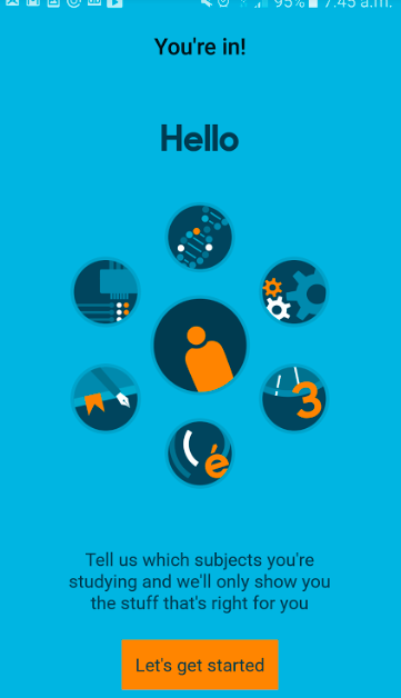
Education, Training, Assessment: Bitesize
|
The design components and layout
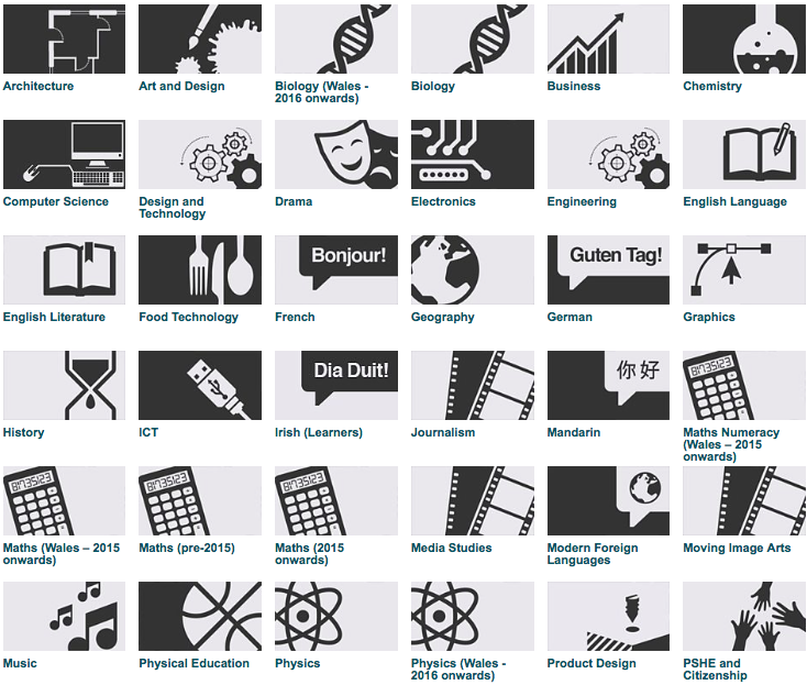
The website and the app have similar colour scheme and design components. They both use their own brand, recogniseable colours of blue, black, orange and white. However, their layouts are very different.
|
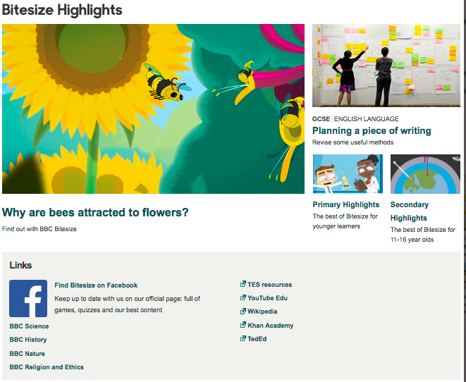
Website Homepage
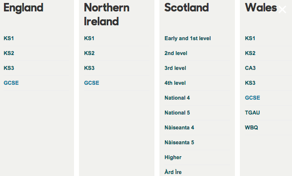
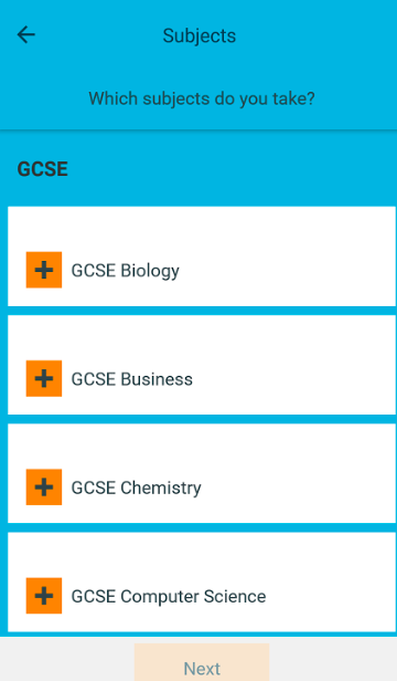
With Bitesize on the website, a registration isn't needed whereas on the app, the user has to sign up and fill out information on their country, exam board, grade level and subjects.
|
|
App Registration Page

|
The app has a much more simple design and layout than the website, with less navigational options.
|
|
The app has less options in ways you can navigate the app and takes the user through a process, by clicking options on a multiply of pages before being allowed to get to the needed information and having to scroll through to get back to the page you want to. Where as on the website, there are sidebars that include links of related topics within the subject they are revising.
|
|
|
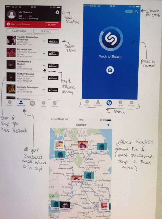
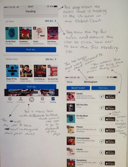
The interactive features of the product
I think the website interactive features of where sometimes, depending on the subject, the user can take a test or watch a interactive video which requires the student to click on elements on the video. |

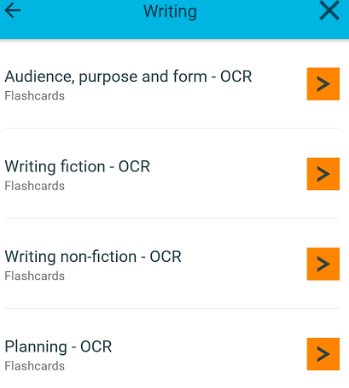
Although the main resource on bitesize website is the revision element, where it is mainly the subject written out with a few featured images to help explain.
|
The bitesize app has interactive features when the user has to sign in or register. Registering includes another interactive process of clicking the options of age, exam board and subjects they are currently taking or want to revise. On different elements of topics, flash cards have been featured on the app as a useful, fun way of learning.
The benefits of the interactive product
|
Bitesize Website
|
Bitesize App
|
The limitations of the interactive product
The website is mostly formatted for laptop/computer devices which makes it difficult to take the resources on the go. I find the design of the website slightly boring, with the layout being very plain and simple by featuring no entertaining images to keep audiences interested. The information on the website is not specific to the exam board. Although there are some video clips, there is less interactive elements with no features of flashcard quizzes and delivers the main option of a revision guide. With the app, it is a long process that has to be completed in order to get to page you need.
The effectiveness of the interactive product

|
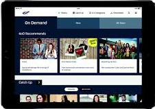
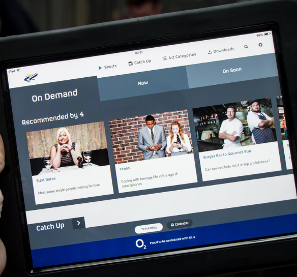
The design components and layout
The design of the website is similar to the app, by having the homepage presenting their newest programmes first. The layout is the same with the sections separating by recency, most popular, box sets and all exclusive. The difference is, with the app, you have to register or sign in straight away before viewing the app whereas with the website, you can view the channel's content without signing in. |
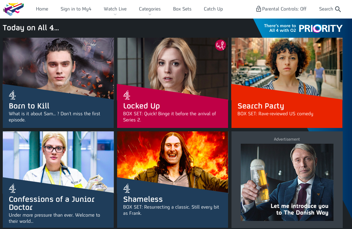
Website Display
|

Phone Display
|
The colour scheme also remains on the app, with a black background and white search tab bar at the top.
As an app, the information content and navigational elements had to be compressed instead of being presented at the top. The logo is kept in the same position to be clear to the users. |
Phone display
|
|
The interactive features of the product
I think the app may have more interactive features than the website, because it requires a registration and then the user is brought to a guide/promotion of what the app includes. On the app, the users can also download episodes they want to watch offline on the go. |

|
|
|
Many of the interactive features appear on the app and the website, for instance, they both have a search bar for users to type in what they are looking for specifically. On the website, it is a option if they would like to sign in and look into their watch history.
|

|
|
Viewers can also watch trailers of television series on the app and the website. Channel 4's website has also created character profiles for fan favourites with images and descriptions. Each t.v show on the app, the ipad and the website include a brief description. The user on the website can hover of the image of the show to see the description and on the app, it is featured before the play button.

|
The benefits of the interactive product
|
Channel 4 Website:
|
Channel 4 Mobile App:
|
Channel 4 iPad:
|
Channel 4 On The Ipad
|
The limitations of the interactive product
I think the website and the app are very effective, especially from seeing the number of people who have downloaded the app. The layouts are clear and the navigation is suitable and understanding on each platform.
- The website doesn't allow people to download content onto their computer or laptop devices.
- For the website, it is difficult to access and watch on the go.
- The app's organisation may not appeal to everyone as some people would want it alphabetically organised instead of genre.
- Downloads will take up large amounts of storage on phone devices.
I think the website and the app are very effective, especially from seeing the number of people who have downloaded the app. The layouts are clear and the navigation is suitable and understanding on each platform.

|
The design components and layout
On laptop/computer devices, the layout is more spread out and because it is on a larger screen, the user can make faster movements with a high quality. The design components on the phone are similar to on the computer, with the same use of colours to keep it's signature look. The structure layout is slightly different in terms of order and navigational elements, as the user is taken to a loading page which is when ads are sometimes included for the game and company. On the main page of both platforms, characters can be selected and settings can be changed. |
|
The interactive features of the product
After clicking play on the app's homepage, the main interactive feature is the aim of the game, to try and direct your character across busy roads successfully. This is done by moving the character side to side and forwards to dodge moving cars or objects. The interactive features are the same on both platforms, except on the computer there is no loading page and the user is brought straight to the page with the play button.
After clicking play on the app's homepage, the main interactive feature is the aim of the game, to try and direct your character across busy roads successfully. This is done by moving the character side to side and forwards to dodge moving cars or objects. The interactive features are the same on both platforms, except on the computer there is no loading page and the user is brought straight to the page with the play button.
The benefits of the interactive product
|
Website
|
App
|
The limitations of the interactive product
The limitation on computer devices, it can't be played on the go and may take a longer process to play by having to turn the computer on. Whereas with phones, most people have them switched on all hours of the day. However, some people may not be on a contract and would not be able to use the app while away from their own internet connection. The people who do, the app may not fully load if the wifi is not strong.
The effectiveness of the interactive product
I think the app is effective as it proves addictive across both platforms and is a popular game used by different audiences, despite it being a simple objective of the game. With the different characters, the users can choose a character that best appeals to them.
|
|
