P2: GENERATE IDEAS FOR A NEW INTERACTIVE MEDIA PRODUCT FOR A CLIENT BRIEF
Specification Document
Specification Document by Bethan on Scribd
Format
If I succeed in creating the app, it should be able to work on the platform of an iphone. However, this does restrict my audience. To widen my audience, I would try to code for the app to work on a range of different apple devices such as the ipad and ipod. An app would be useful as it has the technological convergence of a map, and direct links to restaurant menus, which saves tourists carrying around a map, list of times restaurants are open to and a brochure on what events there are coming up or things to do in Ely.
Mind Map
Navigation Map
Storyboard
P3: PRODUCE A PLAN FOR THE CREATION OF THE INTERACTIVE MEDIA PRODUCT FROM THE GENERATE IDEA
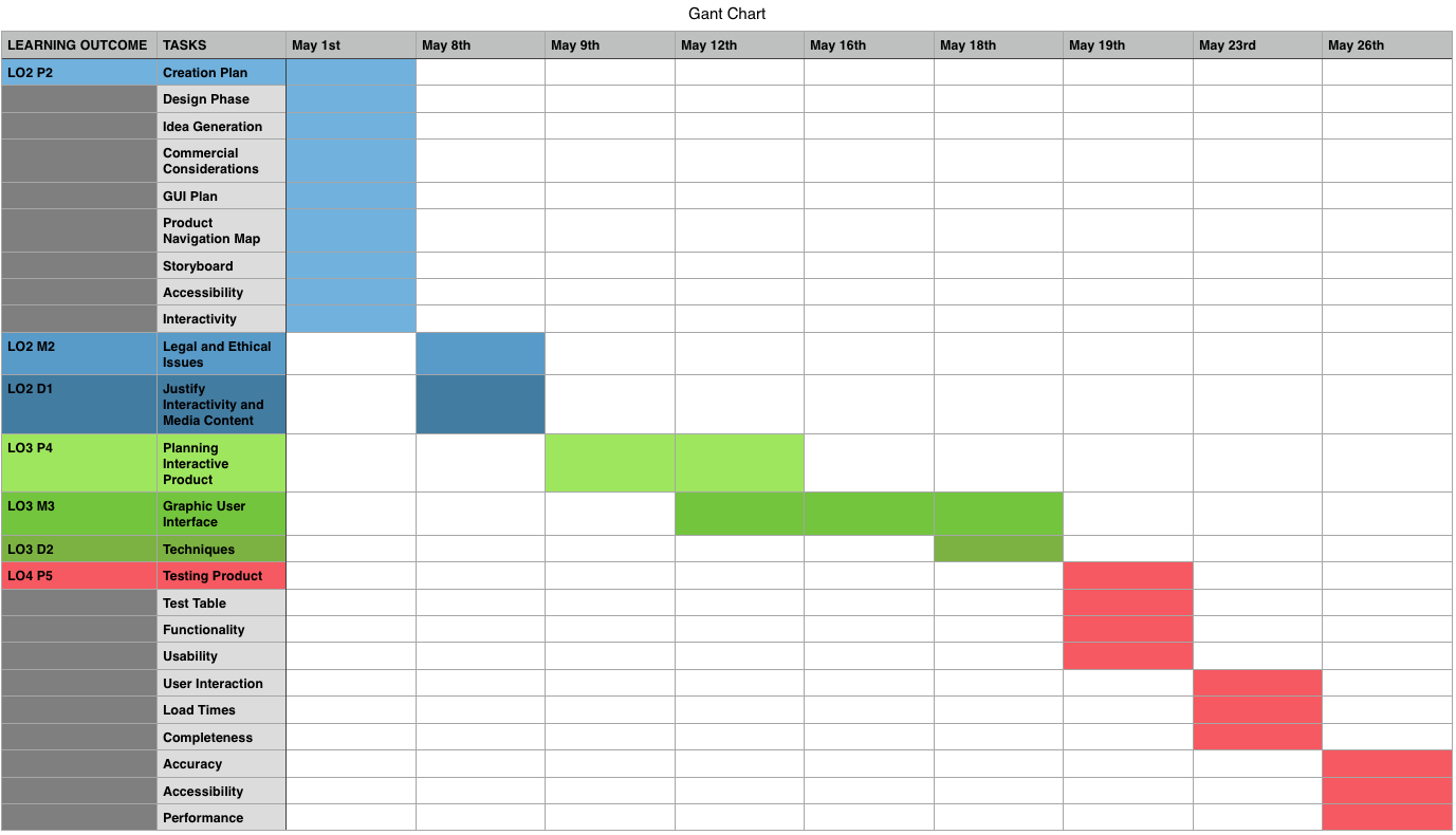
Work Plan
- Gant Chart
I would like to have the app finished before June and in time, so the client will be have sufficient time to receive the app in the platform of their choice and to distribute it. I think the app will have the most success with the audience of visitors if the app is distributed at the correct time because of the half times breaks and bank holidays where people are given the time to visit Ely. However, for contingency, the main aim would be distribute the app for the summer as this is where the tourists numbers would be most high.
Idea Generation
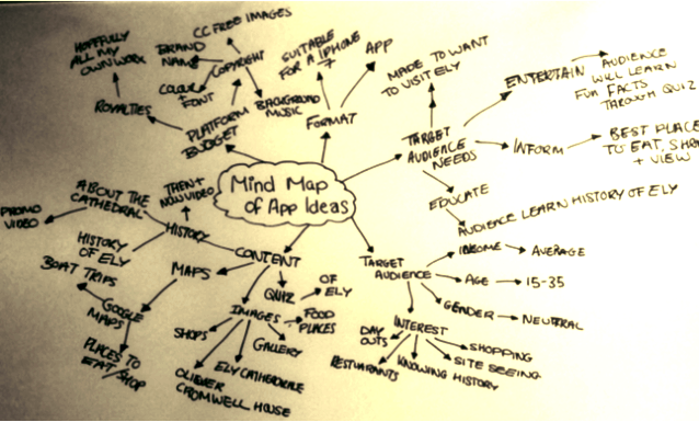
Mind Map #1
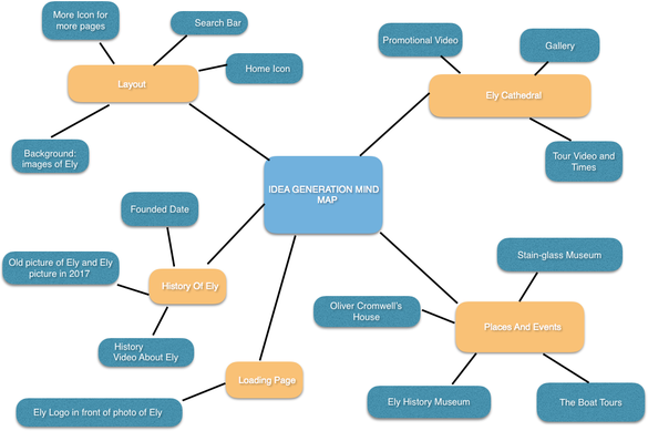
In the mind map above, I have put my first initial ideas into different categories that I intend to merge into separate pages. These ideas were helped from my research of what is Ely and from being a local myself, what I am interested in and applying this to the sort of things tourists might be interested in seeing in their visits.
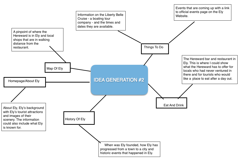
- Mind Map #2
For this Idea Generation Two, I would like to have one page dedicated purely just to the city, as this would hopefully raise the profile of Ely by giving information to visitors about what Ely is, where it is in terms of location and what makes Ely unique. Another idea for this product is the 'THINGS TO DO' page, as this would inform the locals of Ely the upcoming events that they may not be aware of or only have limited information on. The app would allow locals to easy access the information quickly, as in Ely, it can be difficult to find out what events are upcoming.
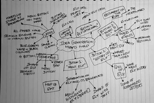
Mind Map #3
In this mind map, I have had this idea about separating the pages instead of having links to other pages. This is because I think this could be overcomplicated to the users and the navigational elements will then to appeal to my target audience, by being simple enough for people who may not use apps regularly - possibly the 40 year olds in the age range.
- Content Mood Board
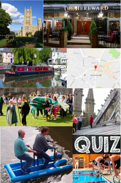
Content Mood Board
|
This mood board represents the range of ideas I have for the content to include in the app. I have tried to chose the content carefully, so there is something that appeals to every member of my target audience.
The map will be helpful as it will guide tourists around Ely and highlight to them restaurants with reasonable prices with good standards. The event of the Eel Festival I think will appeal to tourists and locals as there is something for everyone, however if the event passes before I can create the app, I will instead promote the event of the Aquafest in Ely.
I would like to include at least one leisure activity for the audience in the app. Looking at my target audience, I think they would prefer the boat tours than the water bikes or the pool, because for 20-40 year olds, they might find the boat tour more relaxing. |
Layout Inspirations
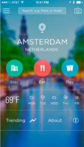
|
I like the background is an image of the location. I would like to have an image of Ely on my homepage blurred with possibly the Ely logo. I will attempt to add a search bar feature but if this fails, I plan to have a simple navigational menu at the bottom of the screen
|
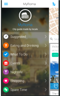
|
This is what I would like for my drop down menu to look like, as it looks easy to navigate. It will open after the three lined button is tapped on and will display the list of menu buttons to navigate. I like the different icons for each button. This is where I could display the four main buttons.
|
|
|
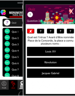
One of the interactive features on the app will hopefully be a quiz. I would like a similar layout like this one for the quiz, where there are three options and they are clear. I would possibly feature an image at the top, above the question, that relates to the topic of that answer or question. The question will appear above the answers and the bottom, there could be a skip button for the users that are stuck.
|
|
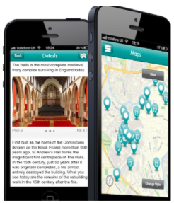
This image shows two separated layouts that I would like to take inspiration from. The first image I think shows a useful layout for the 'About Ely' page, featuring an image and description. The image showing the map is a feature that I would like on my app, showing places, such as shops or the train station.
|
|
I think I like the layout of having a picture as a background inside of a coloured background. This is because I think it gives a professional but modern styled look to the app, as well as the benefit of showing locations and views of the city of Ely.
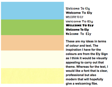
House Colours
|
I would like text to be mostly black, especially for the titles of each page because I think it brings a professional style and would also be gender neutral for the target audience, therefore appealing to hopefully all visitors and locals.
For the title, I would like for text to all be in capitals as I think this would separate the title and the information below. |
Commercial Considerations
In the planning and building stage of my app, the type of commercial elements I would need to consider would be sponsors and advertising. For any company or product that I sponsor, I would need to have permission and make sure that there are no further advertisements within. As an example, if the app sponsored some shoe brand, I would have to make sure that there is no other brand within, such as the star wars logo or characters that are apart of the shoe design or else I would be advertising more than the shoe but also Star Wars - which i wouldn't have permission for.
Graphic User Interface
I aim to make sure the GUI is understandable, engaging but not too complex to use. Everything needs to be organised and in a sufficient order that makes sense to the user, so things are neat and not aesthetically pleasing by being crowded. This may also distract the user from the app's purpose and they may spend less time on the app, or stop using it overall. Navigation is an important aspect of the GUI and it needs to be simplistic and clear. If the format was for a web browser, I would have a 'pointer' for the user to select and command elements on the app but on a phone which is touch screen, they can select things directly. I think icons would be a interesting element on the GUI and would be a helpful way to navigate, especially for users who prefer to see than read. I would possibly have icons on each menu button on the homepage.
The app GUI has to appeal to my target audience, which are males and females between 15 to 35 years. As well as making sure the content is equal for both genders, must also make sure there is no complex language with ambitious vocabulary so the content on pages such as 'History Of Ely', where a description is required, it is still understandable to all ages.
The app GUI has to appeal to my target audience, which are males and females between 15 to 35 years. As well as making sure the content is equal for both genders, must also make sure there is no complex language with ambitious vocabulary so the content on pages such as 'History Of Ely', where a description is required, it is still understandable to all ages.
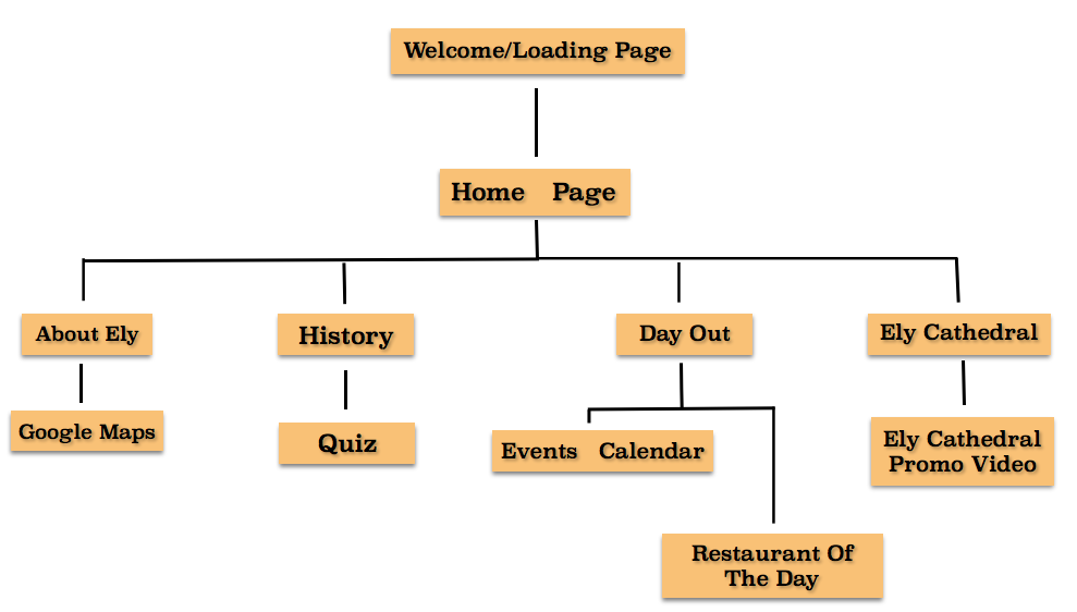
Product Navigation Map
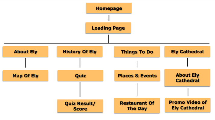
I have tried to cover a wide range of events, places and useful tools that users will find helpful. I want there to be something in the app that will appeal to all parts of my target audience. To try and make this possible, I have not just included a small segment of Ely and have looked into the whole of Ely as a city. This is because the information kiosks will be placed around Ely in a number of places, and hopefully wherever they a placed, a local or tourist, from using the app, will have some event, restaurant or place that is in close to them.
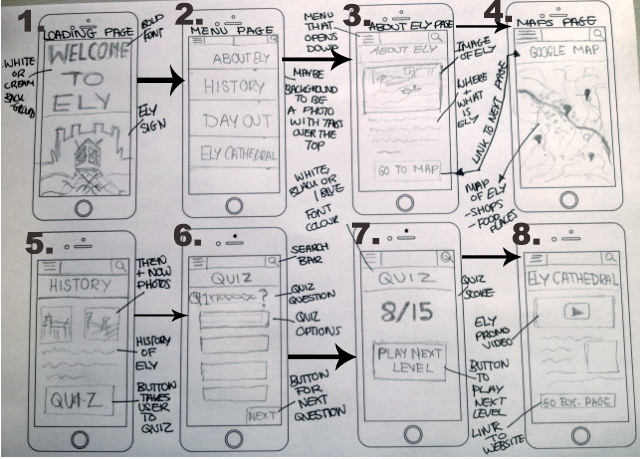
Storyboards
|
|
Accessibility
I hope for the accessibility for the app to be high, as I plan to have a simple and clear layout. The menu buttons will be displayed boldly on the main page, showing the four main pages of the app. After clicking one of the buttons on the homepage, it will take the users to that topic page, for example, the 'History Of Ely' page. The user will be able to scroll down on the information given, in spaced out paragraphs that are broken up by an image. The text will be in a clear font that will be suitable for the professional style and the font size will hopefully be readable by all ages of my target audience. I think it would be useful to have a settings where people can chose a font size, so people will reading disabilities can alter the size of the text and maybe even the colour, although I do not yet know if this is possible. The tab bar will remain at the bottom of the page consistently throughout the person's user experience with the app, which will most likely prove easy to use. This will allow for the user to access other content by pressing on the labelled icons that can either take the user back to homepage or to a specific page.
All videos, images, and icons that may be displayed on the app will be labelled, so in case they, for some reason, do not show up on their device. In the coding stage, I will name the content individually in the <img> code and <a> href code, so the content links to other products or sites. The app will be formatted for the iPhone 7 but to make it run on other browsers, I would need to make sure the product is supported and the content can still be accessed. For example, the web browser of Safari does not run all SWF (Small Web Format).
All videos, images, and icons that may be displayed on the app will be labelled, so in case they, for some reason, do not show up on their device. In the coding stage, I will name the content individually in the <img> code and <a> href code, so the content links to other products or sites. The app will be formatted for the iPhone 7 but to make it run on other browsers, I would need to make sure the product is supported and the content can still be accessed. For example, the web browser of Safari does not run all SWF (Small Web Format).
Interactivity
The main interactive features of the app will be the quiz. The quiz will be a interesting involvement for the users, where they will be able to test their knowledge and learn new things. The questions asked will be appropriate for all ages and hopefully the aim of the game is understandable/readable with people with disabilities. Most questions on the quiz will have four answer buttons to choose from and it is up to them to choose the right one. However, I am aware the quiz, with my coding knowledge, may prove difficult or fail to work. So, in preparation, another interactive feature I would like to have is a link button on the events page that takes the user to a website for further information. The map will be a interactive feature of the app as well, as the user will be able to navigate the places in Ely, as well as clicking the label I provide of a restaurant.
M2: EXPLAIN LEGAL AND ETHICAL ISSUES RELATING TO PRODUCT IDEAS
To increase the feasibility of the product being placed on the app store for my target audience to download, I have to consider legal and ethical issues. The legal issue of copyright applies to my product largely. The Copyright, Designs and Patents Act gives creators the right to control in the ways their material may be used. This means that for my product, I must first make sure I am not taking the idea and purpose of the app from someone else. It is the same with images, as I must make sure that they are not copyrighted and to use copyright free images. If the images are, I must contact the copyrighted owner and ask permission to use their materials in my product. I would most likely have to credit and reference the artist of the images to avoid running into legal issues. The buttons I will be using will be of my own creation from the software but if I was to use buttons of an app without permission, I could be held responsible for stealing someone's work. This is the same with fonts, as using the same font, for example, Facebook, I would be taking the iconic look of the social media website. There are fonts such as 'Arial' that are free to use my anyone and would be a suitable font to have in the app, as it is a easy, clear font to read, meaning the users will most likely have a positive experience using it. Any videos I use, I plan to create my own but any reasons such as not enough time, I would have to source videos and ask for permission which would then lead me into legal considerations of royalties. One idea I have is to include adverts that hopefully relate to the topic of my product, though I would have to make sure I do not include any adverts that could infringe any copyright laws.
I will be creating the brand name, the design and the content of the app but because I am working for a client, they will have intellectual property over the app and will have the rights to decide what to do with it.
To further protect the app, a patent can be applied which is a government license that grants the right to create and selling the product without others doing so.
Data Protection doesn't largely apply for my app as there will be no registration on the app where users would have to fill out details in order to use it. However, I am aware that if the app did collect any personal information, I would have to follow the Data Protection Act of having the data processed for limited purposes, hold information securely and not transferred out of the EU without protection. If I would fail to do this, I could be expected to pay a fine for braking the Data Protection Act law. I decided not to have a registration page as I think this will overcomplicate the app and will not give the user a positive experience if the registering stage was time consuming, especially if they want their information instantly.
Identity theft is stealing someone's name or personal information to access credit or loans. This can happen in apps when someone registers on an app as someone else, for example, if someone created a fake Facebook profile by using another's name and photo with the intention to harass them by damaging their reputation. Luckily, this does not apply to my app as there will be no registration or comment section.
It is highly unlikely that any cyberstalking will happen within the app as I do not plan to have a comment section or anywhere that gives people the access to send threatening messages and frighten/harass another user. If I did have a comment section, it would have to be moderated and have restrictions in what can be said. I feel having a comment section may also interfere with the information supplied on the app, for example someone could comment details on a event that could be false and therefore the content of the app would not be relevant or up-to-date.
With ethical issues, I would have to make sure that I do not misrepresent someone or something in my app. This ethical issue does not hugely apply to my app as at this stage, I'm not planning to include any people in any of the content, whether that be through text, images or videos. I would like to purely focus on the place of Ely and what the town has to offer to the target audience as the one of the main focuses is to raise awareness of the city on the internet. Though, I am aware that there should be no bias or harmful offences to any individuals or groups. With the images I use (just like the information I provide), I must make sure that I do not wrongly represent Ely and mislead the audience by sending out wrong messages. For example, if I used poor, unappealing images of the Ely Cathedral, it would put off tourists from visiting. This relates to that next ethical issue of making sure all content has decency to be included with no inappropriate images or other content that has no relation to the app's purpose. Misrepresentation can include libel issues, where a false statement is made that could be damaging to a person's reputation. I plan to avoid this by checking that the information I include is correct and is purely for the purpose to inform, and not offend.
All the information I have to include must be accurate as one of the main purposes of the app is to be a source of information for the locals, who will be relying on information such as dates, timings, and locations addresses of places they may visit.
D1: JUSTIFY THE PLANNED INTERACTIVITY AND RANGE OF MEDIA CONTENT TO MEET A CLIENT BRIEF
The name of the app I plan to create is called 'Ely' and these are the ideas in what I would like the app to look like.
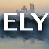
The target audience for the Ely app is 20 to 40 year olds.
I wanted the text of 'ELY' to be as big as possible so it catches the attention of the audience when it is viewed on the apple app store or on the information kiosks. To help raise the profile of the city, I needed to raise the awareness of the app which is especially why I wanted the text colour to be white. I did try a black font colour with a different image but it did not stand out as well. I choose to have the Ely Cathedral as the background image of the app as it is a iconic and praised architect, immediately identifying the app about Ely.
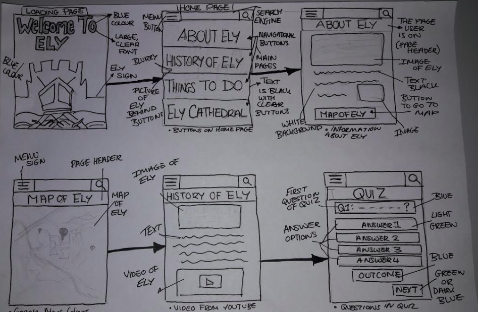
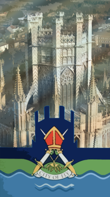
Page One - Loading Page
The loading page is not a page where there is any interactive elements for the user, however, the page still has to have designed contents to keep the app looking professional.
|
To keep an on-going theme, I decided the loading page should have the logo of Ely across the bottom, which will continue into the home page. This continuity of the logo will hopefully raise the profile of the city, which therefore meets the brief. As a loading page, I wanted the design to be quite simple as I think the target audience are at a mature age. Too much content in terms of the image could be distracting and may not be fully seen depending on how fast the app loads.
|
|
I chose this image of the Ely Cathedral at this angel to compliment the logo and to aline with the animated version of the cathedral.
|
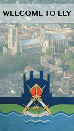
Page Two - Homepage
I wanted to use the logo of Ely, and have it one the homepage of the app because I think this will hopefully raise awareness and popularity of the city from the logo becoming more recognisable.
|
The font for the title is 'Myanmar MN'. I like the look and style of this font because of it's professionalism but also the boldness. It is easy and clear to read, especially with the font being a decent size to suit the app.
I decided to keep a simple colour scheme with the text, as a felt keeping the text colour all black forms consistency throughout the app and compliments well with the other background colours. |
|
The homepage is a little plain though, for the audience needs, I wanted to keep a fairly simple theme and not overcomplicate or add to many design features to overcrowd the page. I feel the audience, especially tourists, will benefit from seeing Ely from this image as it is like an visual introduction from a high angled view.
On this page, a tab bar will also feature of all the icons so the user can navigate to each page. |
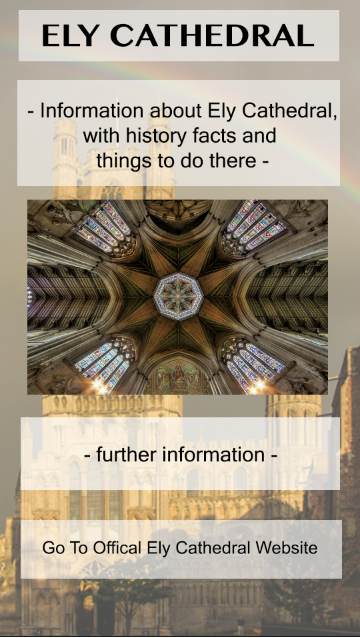
Page Three - Ely Cathedral
The background is a photo of the Ely Cathedral, as this is the topic of the page. At first I was going to have one background colour throughout the app but i found this to be too plain and boring. However, I still wanted a consistent theme so I decided to make the background images with a lower opacity so it almost looks transparent. I think this gives a professional, stylistic look of Ely which complements the sophisticated build of the Cathedral.
|
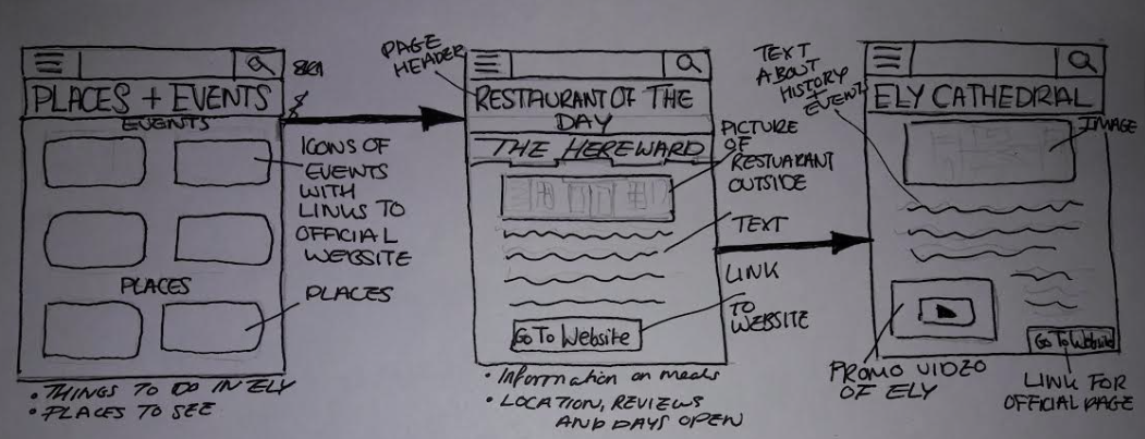
I have chosen to include the interactive features of a button that links to the official Ely Cathedral website, which I think will appeal to the tourists especially as they will be able to a access information instantly from a reliable source, instead of walking to the Cathedral to collect a leaflet on the times.
The information I would like to include would be the history of the Cathedral, and it's development as this will provide facts that locals and tourists may not know. Under the image, I will explain what the Cathedral can offer to the tourists, such as the cafe and the stain-glass museum. |
|
I have decided to use this image on as it gives tourists who have never been a small insight of the Cathedral and I think it makes sense to have an image of the interior as the background image is the exterior.
I would like the text boxes to be white as it would be the same follow the theme and house colours from the app's icon. White as a background allows the black text to be seen clearer and provide the user with a positive, easy experience. |
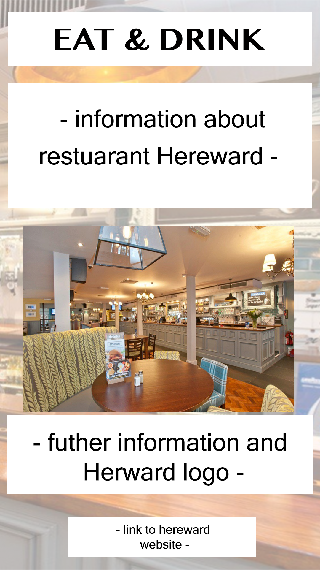
Page Four - Eat and Drink
I think this is an important page of the app, as it includes both relevant content to the user and interactive elements.
|
I have continued to use the same font throughout to keep a professional theme that then will hopefully provide a positive experience for the user. If different fonts were used on each page, it could be distracting and put off the user from continuing with the app. The blocks of white for the text will be slightly transparent, allowing the user to see the interior of the Hereward restaurant.
|
|
I think some people see Ely having a posh persona, so I chose the Hereward restaurant that is in the middle of being elegant and friendly to everyone. There is also a bar which will appeal to the audience as they are above the legal age to drink. Plus, it is a friendly environment for families. The interactive element for the user is a link to the official Hereward website where users can clink on for more information, such as the menu for that day.
|
Page Five - Map of Ely
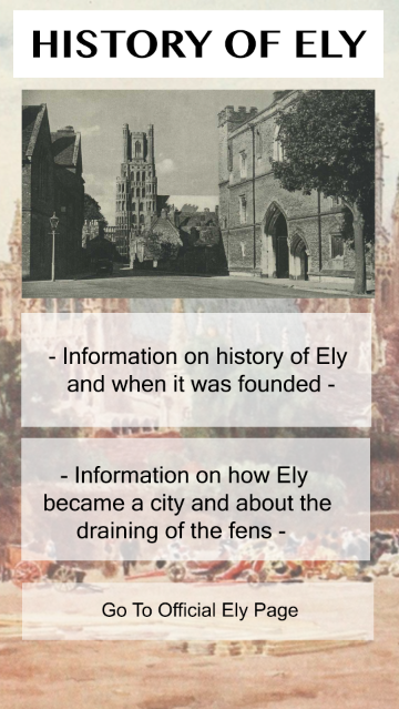
Page Six - History of Ely
This page I think will appeal to the older members of my target audience, especially with the interest of touring Ely and the history of the city.
|
I continued with the theme of having a photo as the background of the page, and used a photo of painting that portrayed what Ely used to look like during the harvest and the community there. I think this matches nicely with the information I plan to present which will appeal under the black and white image of the street before the Ely Cathedral. The content I think will encourage users to visit the city with the strengthen knowledge of its history.
|
|
The interactivity I have chosen for this
|
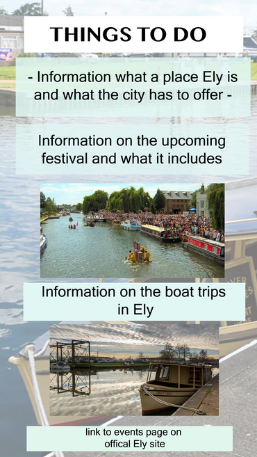
Page Seven - Events/Things To Do
|
Navigation Bar